This is the first Website Evaluation post for Crazy Eye Marketing!
We take a look at Stauer.com – which is an eCommerce website that sells jewelry.
The point of this evaluation is to give tell the company exactly what I would do if I was “king for the day” and to provide them with several actionable steps in order to optimize their website for many different metrics (conversions, click throughs, time on page, number of pages viewed, etc.)
You’re Bleeding
Intense, I know.
Your mobile website, which, should be responsive and not its own separate entity (but, that’s a whole other issue), has a HUGE flaw … the opt-in form does not work.

The subscribe button isn't a button! It doesn't do anything when clicked!
You are literally taking away people’s ability to give you their precious contact information. And contact information is money.
You’re also aggravating these potential customers by your site not functioning properly. They want their coupon, yet, they cannot get it.
I’d address this issue immediately.
Besides, how are you going to measure anything when there is nothing to measure because your site doesn't work?
Your Homepage

Visually, it’s OK (it looks a little dated). Of course, I’d test different colors, pictures, link text, etc. However, without seeing any data, it’s hard to tell how well it’s performing – which pictures/links are drawing the most clicks.
The Main Issue With The Homepage
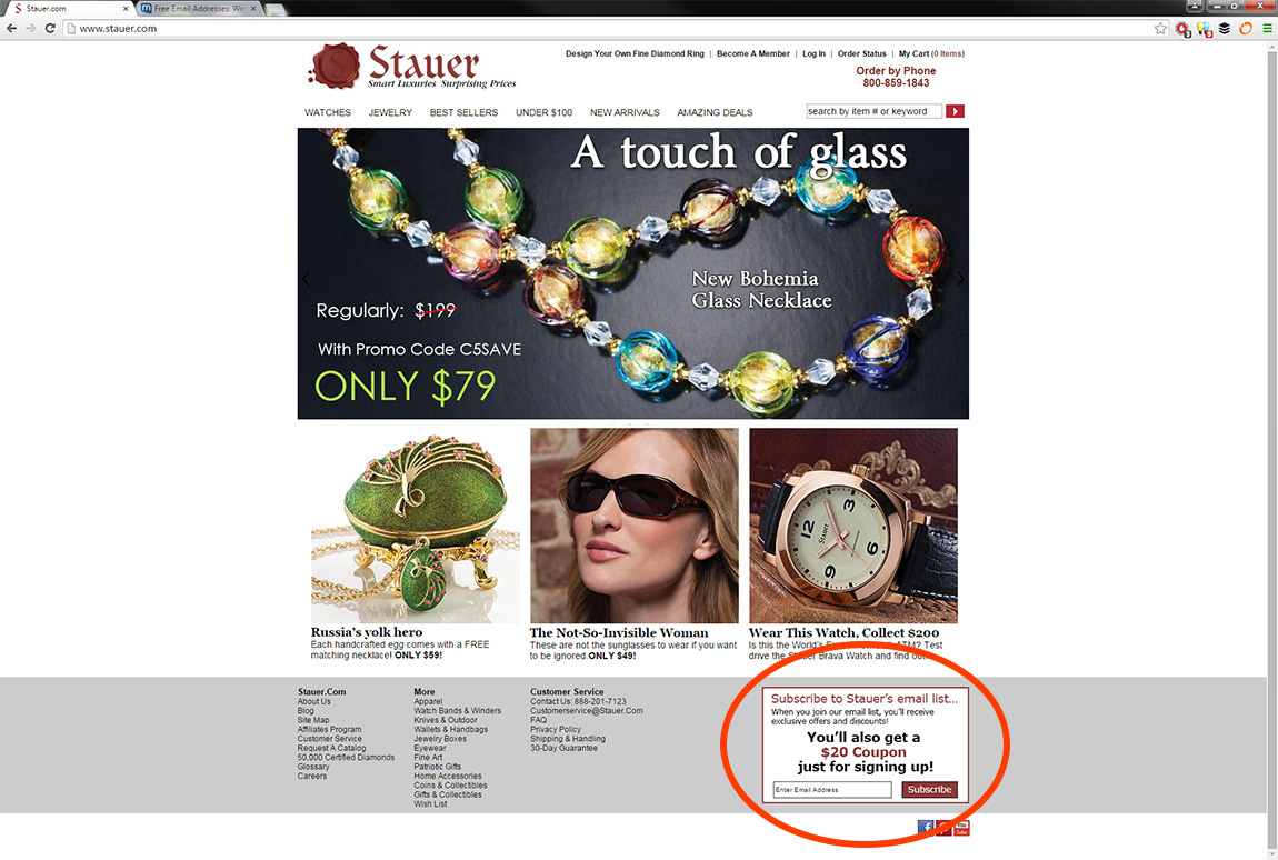
The main issue that I can almost guarantee is hindering your conversion rates is the location of the opt-in form – which is located all the way in the footer.

Do you not want people to see this and give you their contact information? Because that’s the way it appears.
An opt-in form should be front and center, not shoved in the bottom corner.
Your Opt-In Form
Well, I reckon I’ll address the opt-in form now.
I don’t like it one bit.
The Offer Is Not Good
First off, the offer only appeals to people who are about to make a purchase. What about the people that are just browsing? They’re not going to give you their contact information for a coupon they may never use.
Secondly, you’re offering a $20 coupon; however, most items “come with” a massive coupon …
$20 is chump change compared to the $200 I’ll save instantly, without giving away my contact information.
You need to offer something so delicious that everyone from a random window shopper to a jewelry connoisseur is dying to give you their contact information in exchange for a taste.
That $20 coupon will not cut it.
Worst Call-To-Action (CTA) To Ever Exist
The current CTA is the worst CTA to ever exist, ever.
If you’re not sure what I’m referring to – it’s that lovely button that says “Subscribe”. Don’t ya just want to put your email in there and press the button?!
I’m guessing not.
It needs to be “fun” to click, and it needs to be in line with the offer (Give Me My Coupon Now!).
Your Success Page

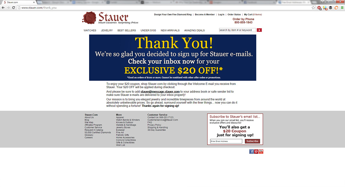
Now I see that the coupon is good on orders of $100 or more and cannot be combined with other codes or promotions – thus, rendering this coupon as useless.
Besides fixing the mobile opt-in form – please, please, please change your offer. All you’re doing with this is aggravating potential customers.
Tracking
It appears that you’re using Adobe Marketing Cloud (at least parts of it), and I can’t quite tell if you’re using it to run Google Analytics, Facebook Conversion Tracking, Facebook Exchange, etc. – as shown within builtwith, but it appears you’re tracking things.
At least I hope you’re tracking things.
Things like opt-ins, click-through-rates (CTR), conversion rates, open rates, social engagements, etc.
Hopefully you’re forming hypotheses and testing them, because Adobe Marketing Cloud can do a lot of stuff – and it’s expensive, so it should be used to constantly run tests – which is what I would be doing tons of.
Emails
I am about to give you some props!
The second I submitted my contact information, you delivered my coupon – as promised!

Regardless of whether the coupon is actually worth anything or not, it was instantly delivered which, a potential customer, would be very appreciative of.
Note: Normally, I would wait until I received several more emails from you before submitting this report in order to better analyze how you build a relationship and close a sale; however, since I'm only “king for the day” – I will go with what I currently have.
As king, I would keep a close eye on how well your emails perform. I would examine things like open rates, CTRs, and engagements. I would split test subject lines, content, images, etc. just like the rest of the web site.
I would also setup different email series for different customers based on what they’ve purchased and/or looked at and/or their buying habits. For example, if someone buys a certain watch, I would have an email automatically go to that person recommending a matching set of earrings. Thus, increasing sales.
Intermission
I am going to hit on a few more topics very briefly because I’m not sure if you’re enjoying this style of post or not, because if not, I don’t want to waste any more of your time.
However, if you would like to discuss more – let me know in the comments below!
Social Media
First off, where is your Twitter account? That is THE most important social media account for businesses. Twitter is one giant conversation that allows you to reach down to your customers and potential customers, and gives them the opportunity to reach you.
Facebook, you have a lot of likes 16,404; however, very little engagement. Some posts have one like. Why is that? My guess is because you’re using Facebook as a giant ad board, and people don’t want to look at ads; so, I would test the heck out of your Facebook posts and the content you’re sharing. Maybe a contest to re-invigorate interest?
Your Pinterest is not very active – the most recent pin I could find was over a year old – why is that? Are you not adding new products? Could you not promote your products in another light? You have great pictures and they need to be seen!
Your YouTube channel – I’m going to keep this short – it needs to be resuscitated.
Instagram – why aren’t you on here? Imagine getting some celebrities to take photos with your jewelry and sharing it with their followers – cha-ching!
There are so many variables you can test on social media, but it looks like you’re letting things fall apart.
Advertising
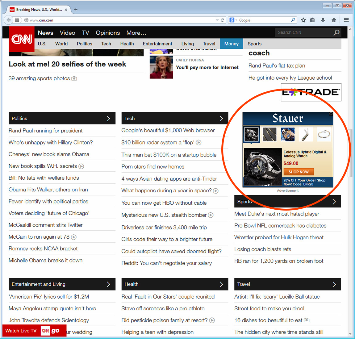
While I was browsing CNN, I was retargeted – nice!

It was good to see your ad follow me around.
As king, I would test hundreds of ads, traffic sources, landing pages, etc.
eCommerce
Of course, there is the whole eCommerce portion – in which I would examine cart abandonment, up-sells, cross-sells, down-sells, etc.
I would test images, button locations, titles, links, etc.
Everything can be tested.
The End.
While I made a few assumptions in this report – If I were “king for a day” – I would take a very objective approach to improving your website – numbers don’t lie.
What did you think of this style of post? Was it helpful to you? Were you able to glean any insights? Leave a comment below!

