Last week I wrote a post about how most eCommerce stores suck at email marketing where the biggest thing that shocked me was the lack of Welcome Emails.
Out of the 20 email lists I joined, I received Welcome Emails from only 4 of the businesses (20%).
This is unacceptable.
Every email list, eCommerce or otherwise, needs to welcome the user to their list.
In this post, I will examine the 4 Welcome Emails I received telling you what I like/don't like about them and pointing out what you can learn from them.
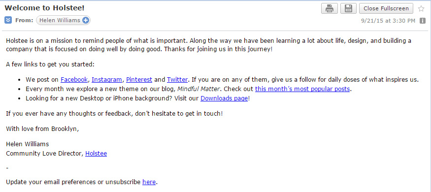
Holstee
I like this email for a few reasons.
I like that it's from a person – Helen Williams. This makes it much more personal and I really like her title, “Community Love Director”! Ha, that's awesome!
I like that it's fairly short and to the point. Helen introduces me to their mission, gives me a few links to get started, asks me to contact her if I have issues, and then she signs off. Excellent.
I like that she links me to her social media pages and tells me that her company shares “daily doses of what inspires us” – I know what to expect when I follow them.
I like that she linked me to her blog's most popular posts. That's great! A great way to learn more about the company.
What I may, or may not like … depending how it's used … is the third bullet, “Looking for a new Desktop or iPhone background?” If they're using it to segment their list (to see who's on a desktop and/or iPhone) then awesome! If not, then they're alienating a portion of their audience for no apparent reason (Android anyone?).
I would also like some clearer expectations as to what I'm to receive by being subscribed to this email list and how often. For example, when will I receive discounts? When will I receive updates on blog posts? How many emails a week should I expect? It's just something nice to know.
All in all, I really like this Welcome Email – good job Holstee!
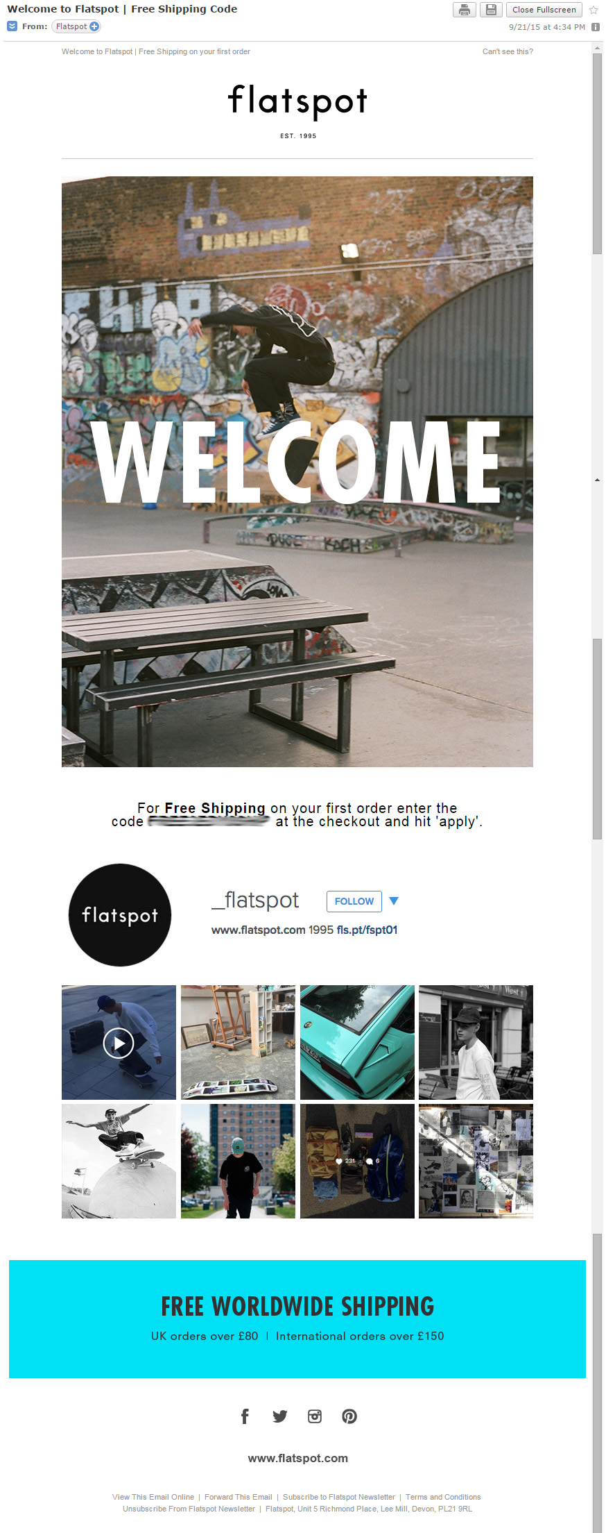
Flatspot
I like this email for a few reasons. First, it's very attractive! Look at all the pretty pictures!
I like that the Lead Magnet (Free Shipping Code) I requested was delivered to me immediately. They kept their promise.
I like that they have links to their social media profiles. This helps me easily locate them in order to Like and Follow.
I kind of like that they have one clear objective on this email – “Follow Us On Instagram”. However, I don't know that I necessarily agree with “one clear objective” in regards to a Welcome Series. I believe Welcome Series should be used to segment subscribers and by having “one clear objective”, it makes it a little harder to segment. But, this is also the first email, there's still time!
I don't like that they don't share any expectations of me being on their list. When are you going to send me stuff? How often? What are you going to send me? etc.
I'd also prefer this email to come from a person. Being that this is an eCommerce store, a personal touch is always nice in order to remind the lead/customer that they're working with actual people, not just machines.
All in all, I think it's a decent email; however, I would test a few things … and maybe they already did, and if it's working for them – great!
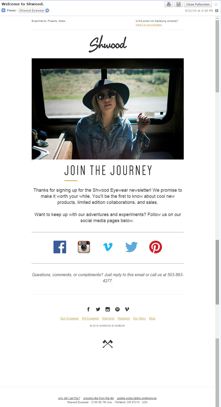
Shwood
I like this email because it's pretty, it's simple, it's short, it sets expectation, it introduces their social media pages, and it lets me know that if I have an issue that I can email or call them.
My issue is … who do I call? Who do I email? Where's that personal touch?
So, for the most part – I like it, but I think they need to make it more personal.
Skinny Teatox
This isn't really a Welcome Email – instead, they automatically sent me their last broadcast email.
This is an “OK” thing to do, as long as no context is required in order to understand what's going on. It's almost like jumping right into the middle of a conversation, maybe I can figure out what they're saying … but, maybe I can't. You never want to confuse a new subscriber.
So, I'd definitely recommend adding a “true” Welcome Email, and then follow up an hour or two later with your latest broadcast.
Anyway, what I really like about this email is that they have obvious, descriptive, buttons. For example, there's a big, pink button that says “Get A 14 Day Skinny Teatox (Free Shipping)” … and it takes me straight to that product. Great!
I also like that they're sharing their latest blog post so I can read more about what the business represents.
I'm going to stop critiquing it here as this isn't a “real” Welcome Email per se (even tho they sent it as one).
Again, I highly recommend adding a “true” Welcome Email.
6 Things All Welcome Emails Should Include
I'll leave you with a list of things every Welcome Email should include:
- Say thank you, Welcome!, etc.
- Include the Lead Magnet
- Short introduction to the business (maybe a link to the latest blog post)
- Set expectations for the email list (perks of being subscribed)
- Include links to Social Media profiles
- Be personal


