What Is A Landing Page?
It’s probably best to define what a landing page is before we get into learning about the elements of a successful landing page!
A landing page is exactly what it sounds like – the page a visitor lands on after clicking a link (search results, advertisement, tweet, etc).
If that page is the homepage, then that’s the landing page. If the visitor lands on a blog article, then that is the landing page.
Now, with regular old search traffic, a blog article can be a fine landing page, especially if it answers the question the visitor is trying to solve. Of course, you want to try and optimize your blog articles for conversions as well, but that’s a topic for another day.
With any paid or promoted traffic, you want to send the visitor to a dedicated landing page.
A dedicated landing page serves only one purpose – to drive an action.
In most cases, and the in the case of this article, the action a landing page seeks is to collect contact information.
Just know, some landing pages attempt to sell products, others act as “click through” pages to keep the marketing message the same, and others aim to drive people to a physical location.
The Main Thing To Remember
This part is incredibly important, because without it, it won’t matter how great your landing page is – it will never perform well.
The message that you promote (advertisement), must match what the landing page says.
For example; you cannot have an ad that says “Get 10% off your next bike purchase!” and have a landing page that mentions nothing about a 10% off coupon.
The marketing message must remain consistent!
Elements Of A Successful Landing Page
Of course, some landing pages have all of these elements – some have one or two of these elements.
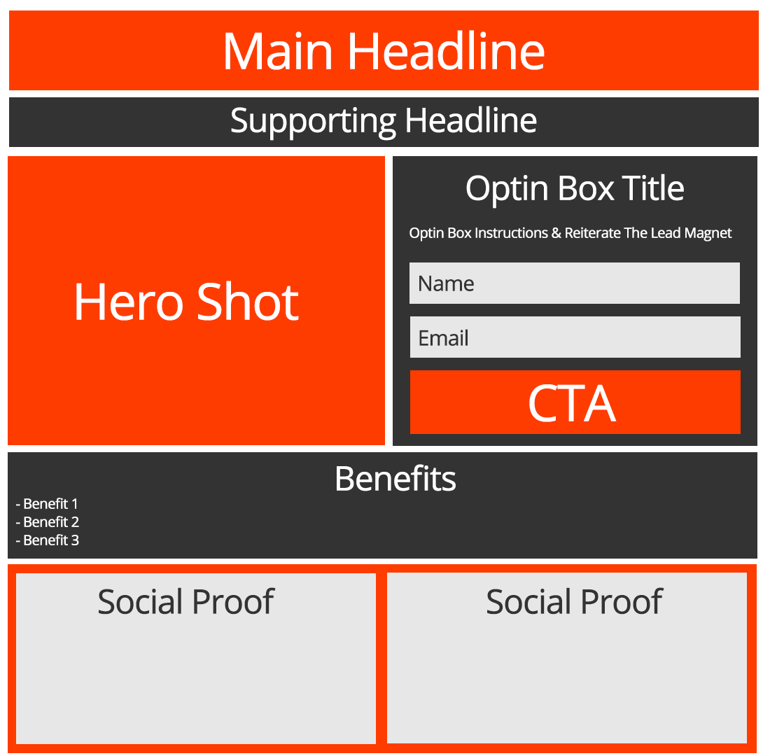
Main Headline
This is the big, bold, headline across the top of the page that promotes the marketing message received in the advertisement. It is arguably the most important aspect of a landing page because if people can’t get past the main headline, they’re unlikely to perform any action.
Supporting Headline
You guessed it, this headline supports the main headline!
Hero Shot
A nice, clean, pretty picture of what you’re “giving away”. Note: this does not always need to be a picture – videos can work well too.
Benefits
List some of the benefits people will gain after giving up their contact information. Remember, it’s all about benefits to the individual – it’s not about the features of what you’re giving away.
Opt-in Box
This is the form where a visitor enters their contact information.
CTA (Call-To-Action)
This is the button a visitor will press to submit their information in exchange for the promised lead magnet. Believe it or not, the CTA is the second most (and in some instances, the most) important aspect of your landing page. The CTA should match the Main Headline and not be something generic like “Signup Now”.
Social Proof
Include a testimonial or two, or an “as seen on” section to give proof that what you’re offering is socially acceptable.

